
Graphic design
Objective
This portfolio highlights major graphic design projects:
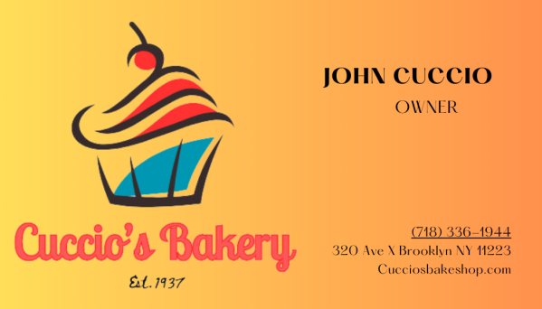
Cuccio’s Bakery branding, including a logo and business cards that establish a warm, professional identity.
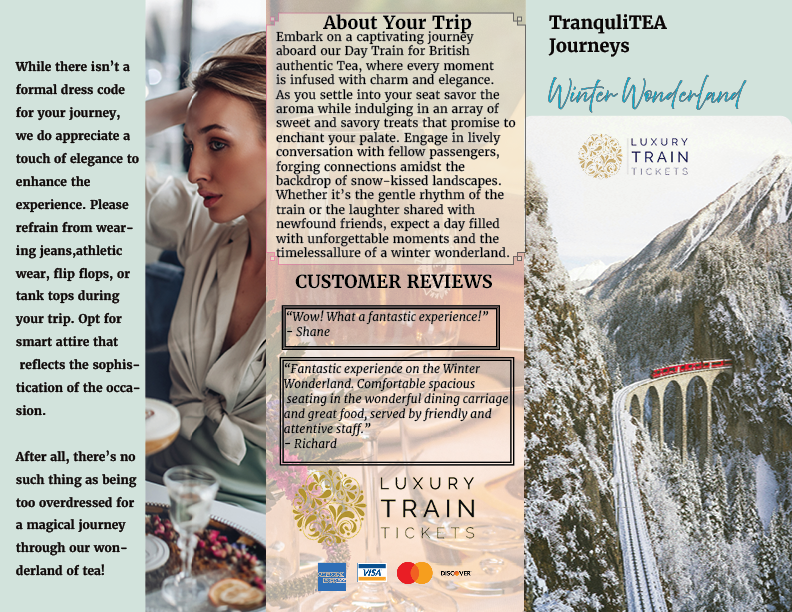
A tea packaging concept using color psychology to influence consumer appeal
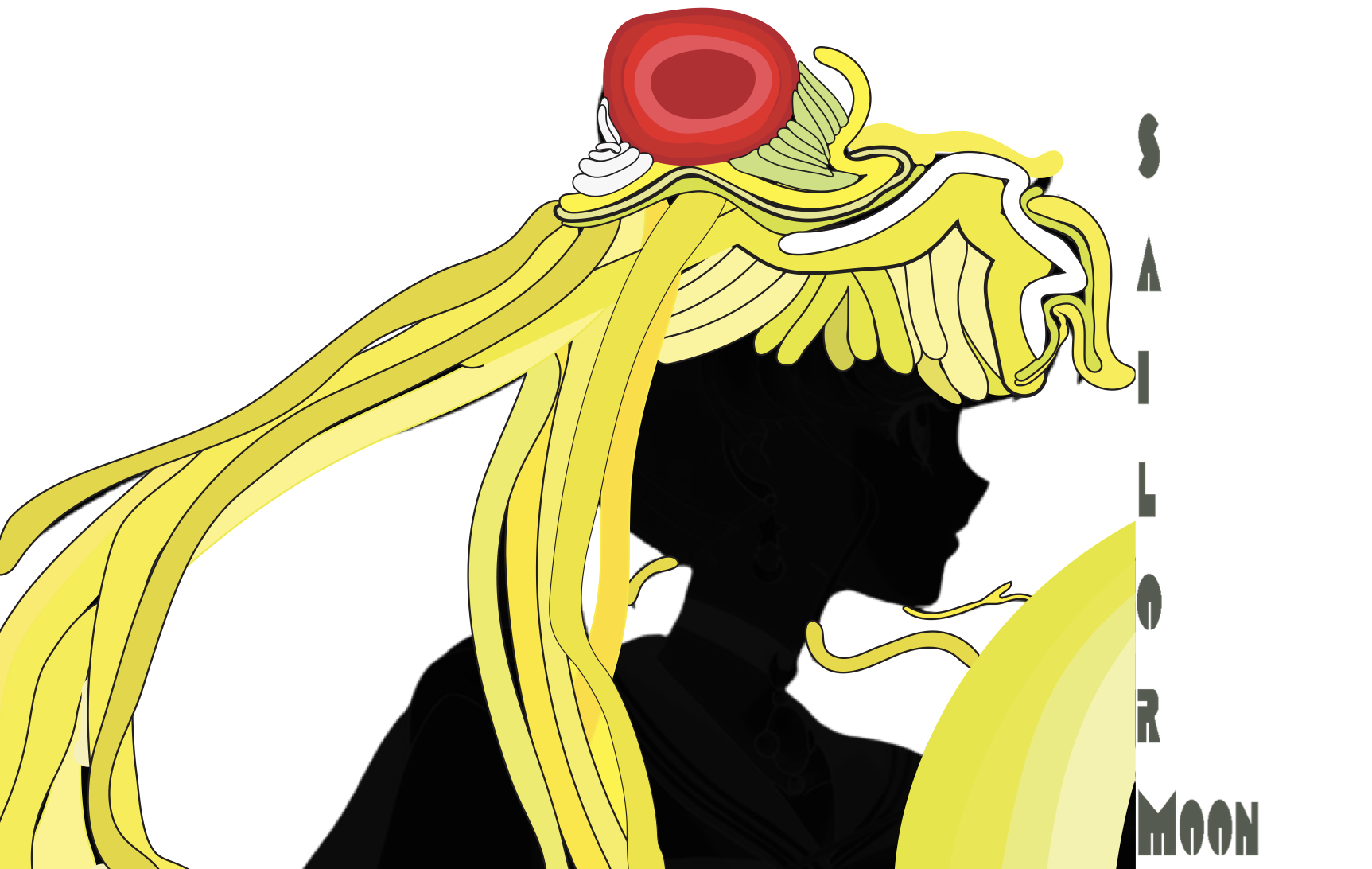
Milton Glaser – inspired illustration of Sailor Moon, showcasing expressive line work and bold color.
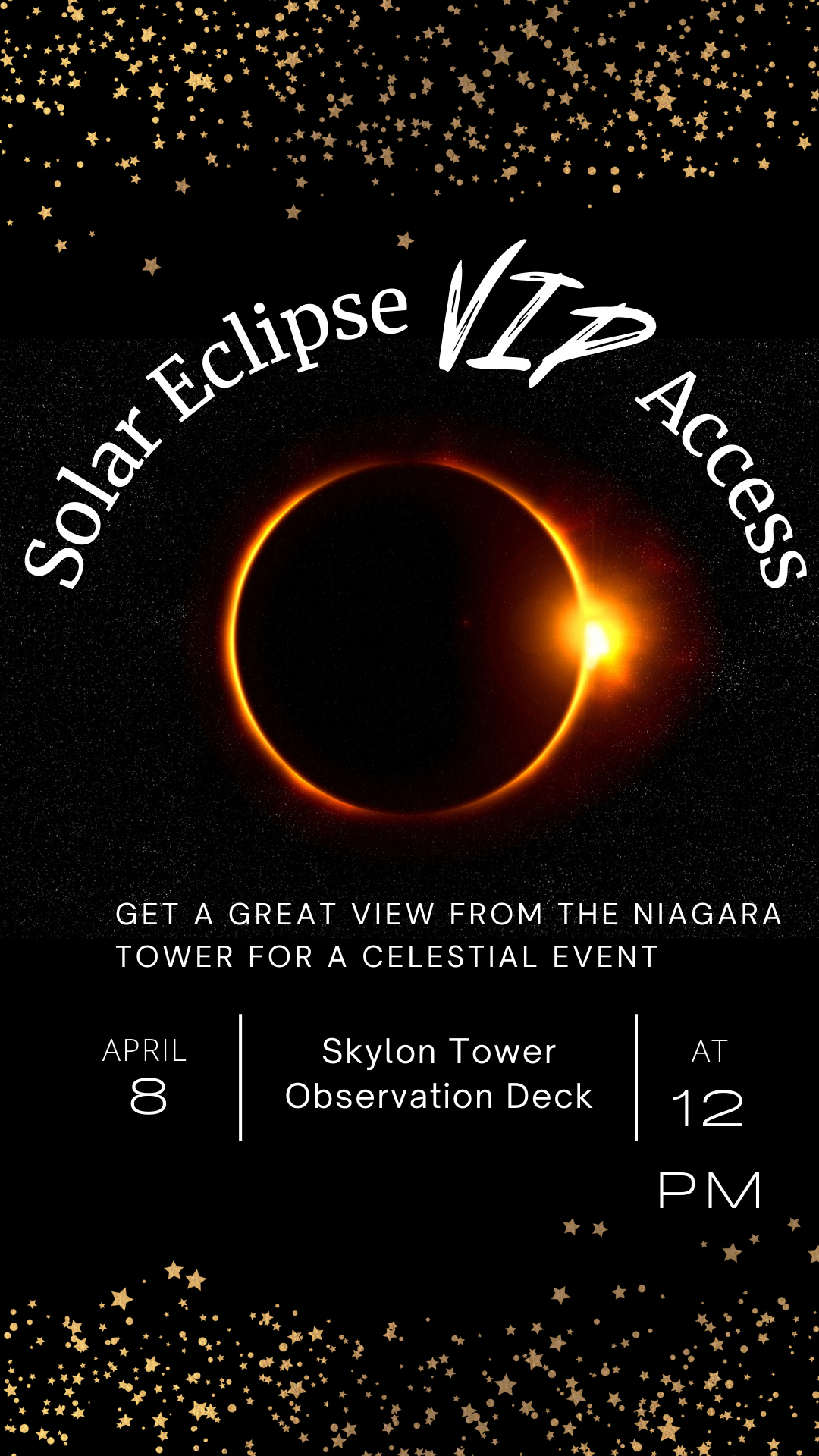
A solar eclipse event with a full design package that captured the rare celestial experience through cohesive branding. Materials included posters, flyers, and social media graphics,
A dance newsletter designed to inform and inspire readers with clear layouts and dynamic visuals. Each project reflects my ability to balance creativity, technical skill, and conceptual depth while delivering cohesive, audience-focused design.
Overview
As the designer, my objective was to explore how visuals shape perception across different contexts — color psychology for consumer appeal, illustration and cultural storytelling and materials that captured wonder while uniting community engagement on social media and in person designs.
Each project demonstrates my ability to balance creativity, technical skill, and conceptual depth while delivering cohesive, audience-focused design.
Cuccio’s Bakery designs
Cuccio’s Bakery, a family-owned shop located in my neighborhood, was the focus of my branding project. Being right next door gave me firsthand insight into the store’s identity and customer base. I observed the warm, inviting atmosphere and the strong sense of community it fosters, which helped guide the design direction. My research centered on capturing this approachable yet professional feel — balancing tradition with modern appeal.
I explored color palettes, typography, and imagery that would reflect both the bakery’s heritage and its role as a neighborhood staple, ensuring the logo and business cards aligned with its authentic character.

Milton Glaser
For this project, I studied Milton Glaser’s bold colors, simple shapes, and expressive lines. Inspired by his blend of art and culture. I chose Sailor Moon, whose hair and silhouette suited Glaser’s style for a playful glow. Using adobe illustrator and researching his balance of simplicity and impact helped me reinterpret a pop culture icon in my own way, especially with the hair designs.
TranquliTEA brochure

Visiting a winter wonderland
For the brochure project, I focused on how to organize information in a way that was visually engaging yet easy to navigate. I studied professional brochures to understand layout, hierarchy, and balance between text and imagery. Using Adobe InDesign, I explored grids, margins, and typography options to build a strong structure.
I also researched color psychology and design principles to ensure the palette and style aligned with the theme, creating a brochure that communicated clearly while maintaining visual appeal.
Concept
The brochure was designed around the idea of a winter train ride, blending the magic of travel with the coziness of the winter season. I wanted the design to capture both the excitement of the journey and the comfort of the destination. Snowy imagery, cool-toned palettes, and elegant typography reflected the crispness of winter, while warm accent colors conveyed the sense of relaxation and joy found at the resort. The concept aimed to immerse readers in the experience, making them feel as though they were already on board, anticipating a scenic escape.
OASIS
Americas favorite tea
For the tea packaging project, I studied how design affects buyers by looking at colors, fonts, and images. I checked out current tea brands to see how their packaging shows flavor, mood, and style. I also tried hand-drawn sketches to create natural, friendly looks before making them digital on indesign.


For the solar eclipse event project, I reflected on my own experience attending the eclipse in Niagara Falls. I noticed that while people spent hours outside waiting, there wasn’t much provided in terms of information, activities, or engagement despite the time and money people invested for the weekend.
This observation inspired me to research how event collateral — flyers, schedules, and interactive materials— could enhance the audience experience.
I also looked at examples of astronomy-related event branding to see how visual design can make complex science feel exciting and accessible.
Concept
The concept was to design a community-centered event package that combined science, fun, and anticipation for the eclipse. I created materials in Canva that included informative graphics, activity sheets, and promotional visuals that went beyond just marking the time of the eclipse.
The design emphasized the wonder of the celestial event while also providing engagement opportunities, so attendees would feel their time and investment were well spent.
You’re invited!


A dance school newsletter
Based on a real dance school